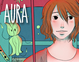
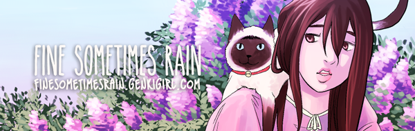
So I’m trying to come up with a promotional bookmark to hand out at cons. This is the first design I have ready to share. So questions….How do you feel about horizontal bookmarks? Yay or Nay? Sadly I don’t have much by way of vertical art…or at least art that looks good in vertical. Second, can you read it ok? Like if you had it in your hand and said to yourself, I’m gonna look up this site, can you read it well enough? I don’t need it to be able to advertise across the room obviously. 😉 After I suss out the front design, then I plan to work on the back design that will have more info on it. With that being said, is there any info you like to see on bookmarks whether it be front or back?
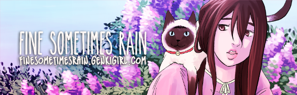
Here’s edit #2:
Here’s the third edit. I discovered the font had a bold version, but right now I think the font may be too close to the edge. I like room around my fonts.
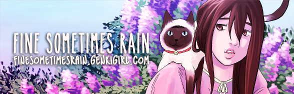
and edited to allow for a little more room between the edge and the start of the font.


I think a horizontal design is fine. I would be concerned that the text could be difficult to read depending on the size of the bookmark once printed. Without seeing a version in person though, it is difficult to be sure.
Yeah I realize that web viewers are at a disadvantage because I am able to print it out and see it in my hand. Both versions are readable to me in print, the edit a little more so. I think maybe the best course of action will be to test it on my parents who need glasses to read stuff…it will be the mega-test. XD
The edited version looks more clear to me. I think getting another opinion in person sounds like a good idea.
I don’t know what it’s size in print is but as I see it now I feel the bottom text could be more immediately clear (though it is ultimately legible). Personally I’d try…
Adjusting tracking for *smidge* more space
Adjust the kerning between the words so that they aren’t obviously spaces but subtly definition between the words.
Or looking at a sans-serif instead of the same handwriting style font.
But man, text in particular is SO different printed! So it may be completely fine!
I’ll tinker with the tracking and kerning more, overall in print it’s legible and looks fine, but maybe adjusting those things will enhance it more.