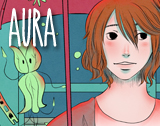
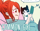
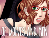
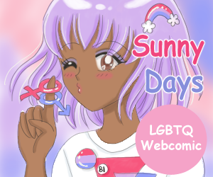
So I’m trying to come up with a promotional bookmark to hand out at cons. This is the first design I have ready to share. So questions….How do you feel about horizontal bookmarks? Yay or Nay? Sadly I don’t have much by way of vertical art…or at least art that looks good in vertical. Second, can you read it ok? Like if you had it in your hand and said to yourself, I’m gonna look up this site, can you read it well enough? I don’t need it to be able to advertise across the room obviously. 😉 After I suss out the front design, then I plan to work on the back design that will have more info on it. With that being said, is there any info you like to see on bookmarks whether it be front or back?
Here’s the third edit. I discovered the font had a bold version, but right now I think the font may be too close to the edge. I like room around my fonts.

and edited to allow for a little more room between the edge and the start of the font.

